Step 8
In the previous demo, we learned about Bootstrap breakpoint: a point at which the layout changes. Bootstrap defines the following breakpoints:
| Screen Size | Breakpoint | Class modifier |
|---|---|---|
| Extra small | $<$576px | none |
| Small | $\ge$576px | -sm |
| Medium | $\ge$768px | -md |
| Large | $\ge$992px | -lg |
| Extra large | $\ge$1200px | -xl |
We can use the class modifiers to, e.g., make our layout change at a different breakpoint.
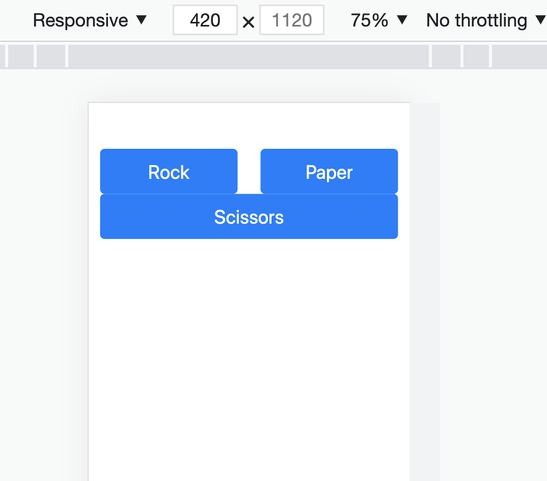
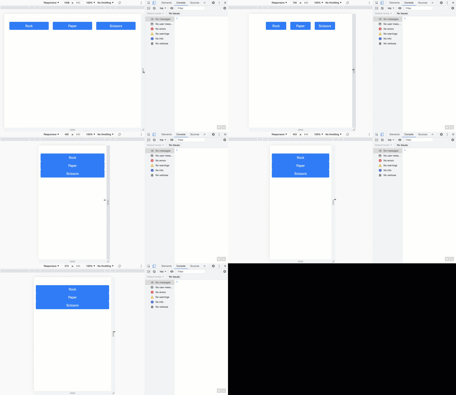
For example: as the screen size gets smaller in the previous demo, there is a point where the 3-column layout collapses into a stack. Before reaching that point, however, there is an earlier stage where the last column gets stacked under the other two:

I don't like this transition! I would prefer it if the transition goes from 3-columns to 3 (stacked) rows without this intermediate step. The good news is that I can fix it. I can use a breakpoint class modifier to ensure the first two columns are stacked with the last one:
<body>
  <div class="container my-5">
    <div class="row">
-     <div class="col">
+     <div class="col-sm">
        <button class="btn btn-primary btn-lg w-100">Rock</button>
      </div>
-     <div class="col">
+     <div class="col-sm">
        <button class="btn btn-primary btn-lg w-100">Paper</button>
      </div>
-     <div class="col">
+     <div class="col-sm">
        <button class="btn btn-primary btn-lg w-100">Scissors</button>
      </div>
    </div>
  </div>
</body>
The -sm indicates when we reach the breakpoint of 575px, all three columns must be expanded fully.

Now for the icing on the cake, let's adjust the gap between the columns, so they are more presentable when stacked!
<body>
  <div class="container my-5">
-   <div class="row">
+   <div class="row gap-2">
      <div class="col-sm">
        <button class="btn btn-primary btn-lg btn-block">Rock</button>
      </div>
      <div class="col-sm">
        <button class="btn btn-primary btn-lg btn-block">Paper</button>
      </div>
      <div class="col-sm">
        <button class="btn btn-primary btn-lg btn-block">Scissors</button>
      </div>
    </div>
  </div>
</body>
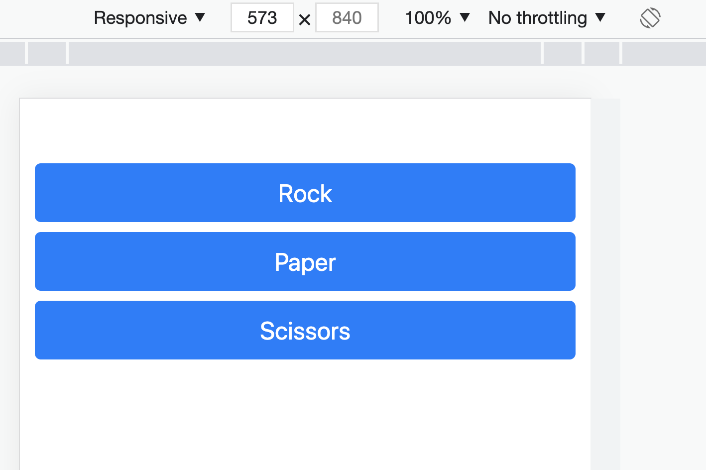
The result should look like this:

Bootstrap's grid system is one of its strongest suits; you can achieve a lot with it.