Step 3
Bootstrap is primarily used for the following utilities:
-
Tens of built-in components commonly used for building websites such as navbars and menus.
-
The layout system (container, grid, etc.) to lay out the components in a responsive way.
In this context, responsive means (dynamically) adjust the layout (and styling), so the web page renders well on any device or screen size. Read more about it in this Wikipedia entry.
We will use both of these utilities in our application. To start with, let's add three buttons to the page:
<body>
  <button>Rock</button>
  <button>Paper</button>
  <button>Scissors</button>
  <!-- Not shown: Bootstrap JavaScript bundle -->
</body>
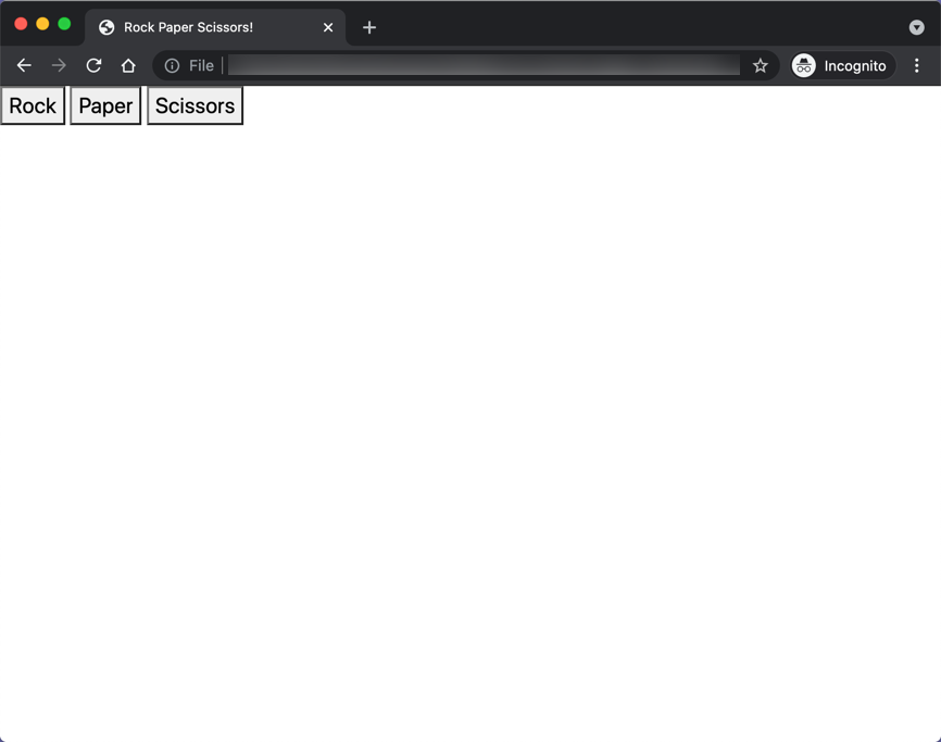
Save the file and open it in a browser:
Reminder:
Use either Live Server or Live Preview in VSCode to view the page in the browser. These extentions allow us to serve (open) an HTML file in a browser as if it was served from (deployed on) a (web) server. They also automatically refreshes the page every time we save changes to the source files.
To use Live Server for instance, right-click on
index.htmland select "Open with live sever." This action will open your browser and point it to http://127.0.0.1:5500/index.html. Now when you changeindex.html(and save the changes), the page in the browser will be refreshed automatically.
Notice how the buttons are bleeding into the edge of the page. Let's fix this issue in the next step.